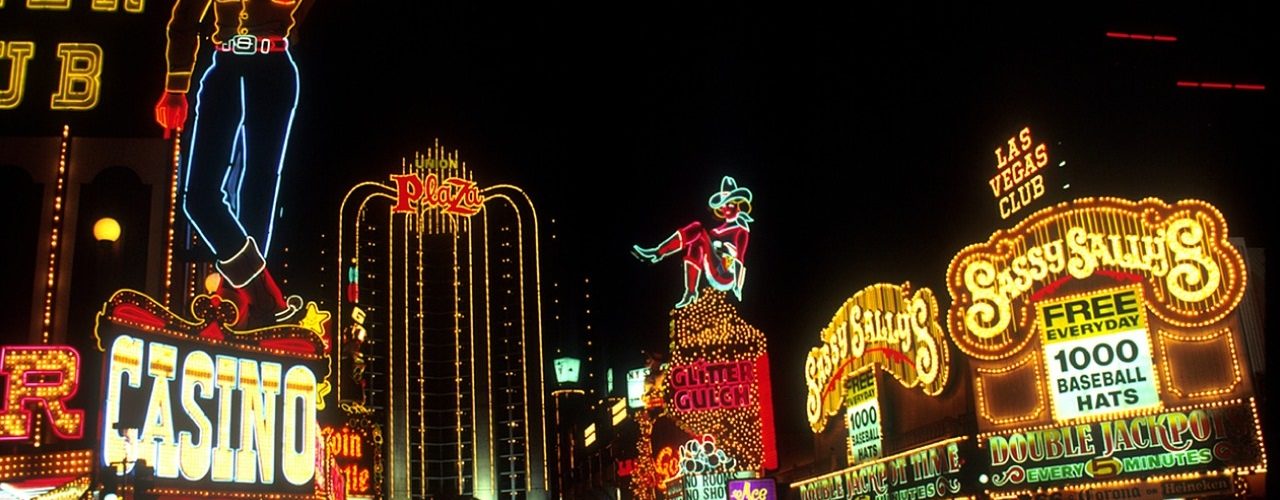
Signage matters to a business. As Chron states, having excellent visibility is a critical factor in a company’s success. Physical signs have been one of the oldest methods of advertising that business has employed to get the attention of customers.
Signs provide information as well as a visual aesthetic that can be used to enhance the business’ image further. The idea of brand marketing, where a company uses a brand to help deliver its message to the world, has a significant ally in signage. Whether it’s a wooden sign with raised letters or a simple custom neon sign, a business can benefit from having their name out in the open.
But why do these signs work? What helps them attract and keep the interest of consumers? How do they get their message across? Signs, like most other forms of marketing, are ways of tweaking human behavior so that it conforms with what we want it to do. Humans can be intractable creatures, so any tweaking of their behavior leads to resentment unless the reward for following the suggestion outweighs the feeling of being railroaded. People that are impacted by signs usually don’t even know that advertisers are influencing them, and this is the power of a good sign.
Changing Behaviors Through Suggestion
The journal Plos One mentions that signs are a tool that can be used to encourage behavioral change. At its core, all marketing attempts to do this, but some methods are more impactful than others. Signs have several advantages as an advertising medium that other media don’t have. Among the benefits that signage can offer to a business are:
Flexibility – A sign can be used in any number of different ways, or adapted to fit seasons. A company could have a sign made especially for Christmas or Halloween to capitalize on the festive air.
Relevance – The critical element to marketing is timing. Signs can be used to deliver the right message to the consumer at the right time consistently. A perfect example of this is a “SALE!” sign, informing customers of lower than average prices available for a limited time only.
More Personal – Broadcast ads for newspapers and TV are scattershot techniques that don’t aim at an individual, but deliver a message and hope it falls on fertile ground to show results. Signage appeals directly to a customer and is likely to cut through the trepidation that a consumer might have because of its directness.
Not Easily Filtered – The human brain is a remarkable instrument when it comes to filtering out noise. Sadly, it considers many forms of advertising part of this noise. Signage doesn’t fall into the category that gets automatically filtered out and so is a much better way to ensure that a company’s message goes through.
Better Customer Experience – A study done by Nielsen, as reported by Digital Signage Today, indicates that as much as 72% of respondents think digital signage is a “cool way to advertise”. Customer experience can have a significant impact on what a customer retains from an interaction.
Doing Signage Right
All of the above benefits that a sign offers to a company hinges on the company following through on doing their signage in the most engaging way possible. It is more involved than simply throwing words onto a neon sign and hanging it up where all can see. To find the balance of where signage should fall, a business must consider designing and deploying a sign just like it would most other marketing activities. Companies hoping to use effective signage should keep a handful of rules of thumb in mind, including:
Proper Placement: Getting the highest number of eyes on a sign is important, but placement comes with the added burden of relevance. Advertising a hobby as a location where a demographic that is unlikely to be interested in it usually frequents will not end well. Signs need to be placed to take advantage of the presence of the demographic the business appeals to.
Complimentary: IMotions informs us that the Stroop Test (which prints the names of colors in a different tone to the one being described) shows how humans make relevant connections between colors and descriptions. For signage, interference, where the sign tries to communicate two different ideas at the same time, can be confusing and should be avoided. Confusion can easily result from mismatched messages and goes against what a business intends to do with a sign.
Simple is Best: Designing a sign doesn’t need a ton of complicated techniques. Simple signs have been useful for a long time by simply getting their message to the customer in the least flashy way that exists. Time Magazine notes that the average human attention span is about eight seconds. More straightforward signs take less time to decipher and are less likely to lose the customer’s interest before the eight-second window runs out.
Good Timing Matters: Opportunity is about getting the timing right. Simple, static signage is proper in some locations, but in others, it’s just dull and dreary. For an area where a consumer might be stuck for some length of time, a sign could also serve as entertainment. Knowing where dynamic signs are most effective as opposed to static ones is an essential defining factor in the success of the signage.
Consumers Care More About Relevance
Advertising has gotten a bad rap in recent years because of how it impacts usability and experiences. HubSpot mentions that users tend to dislike ads because they are annoying. However, the very same study explains that most users would prefer to filter their ads to have the most relevant content coming to them. Signage isn’t as sophisticated as digital advertising, but it can still take advantage of the relevance of their positioning. Signs are about informing the customer. They are a unique advertising experience that is non-intrusive and if deployed selectively, can help a business see real returns.
About the author


All opinions and facts are that of a third-party writer, not an official Feenta.com author. It’s an article written by a guest author. If you’d like to submit an article, go to our Write for Us page.


